I’ve been trying to find a way to reconcile my love for three things: data, health, and art — and for the longest time I’ve had trouble splitting my time, efforts, and energy between the three. Am I a data scientist? A public health enthusiast? A lover of music and graphic designer?
Where should I spend the most of my time? Learning Python or comparing contraceptive prevalence among different regions in India? Working on my design projects or finishing my Introduction to Probability problem set? Contemplating figurative language for Fiction/Poetry Writing I or deciphering the demographics of a country from a population pyramid?
But I finally feel like I’m getting it. Like I finally found out the secret of my universe without even knowing it. And I’ve decided that I don’t have to choose between the three, and that sometimes I can be all three at the same time.
This realization probably spurred from two things: my public health class on data visualization, and my recent involvement with a clinical scheduling research team.
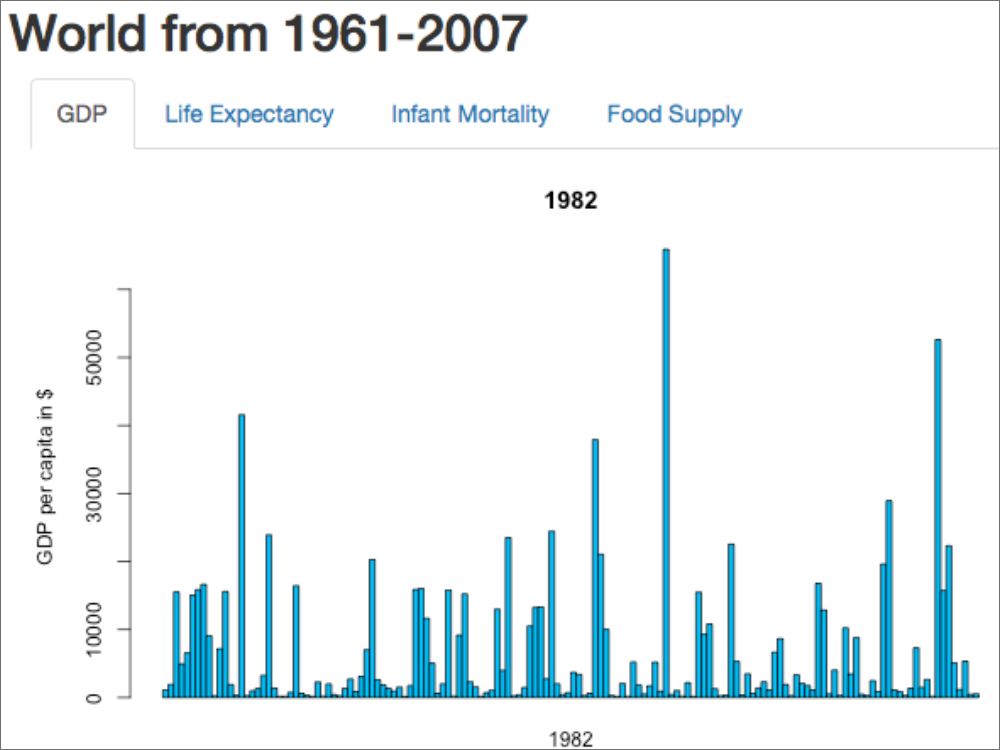
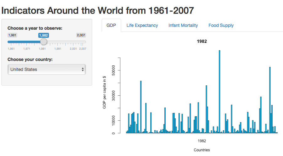
In Data Visualization for Individualized Health, we’re coding both functional and visually pleasing (the two best kind of descriptions in the world) web applications for use in the field of precision medicine. For this week, my class was split into groups and tasked with building a Shiny app that reads in data on a health indicator of our choice, and displays and “individualizes” that information. I registered for the course because I knew it could combine my love for data and public health — I love the idea of looking at public health through a data-driven or statistical perspective. However, I wasn’t aware of truly, the art behind these data visualizations. Our readings talk a lot about principles of art and graphic design, laying out ways to make displays clear, informative, and aesthetically pleasing. I’m practically salivating.
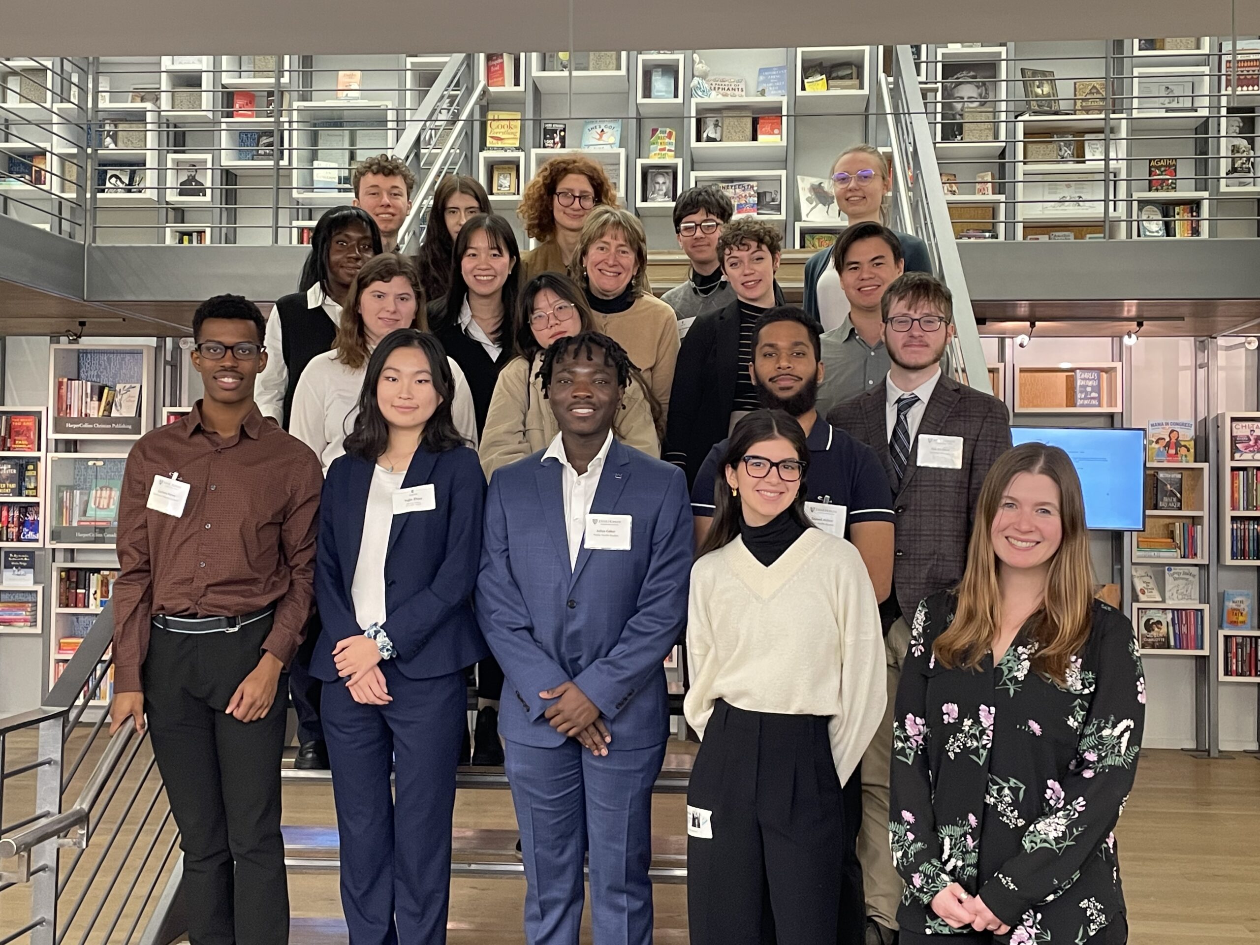
Just yesterday, I had my first meeting with a research team I just received the opportunity to join. Starting within the applied mathematics & statistics department as a branching off of the baseball scheduling group, the team uses optimization techniques to schedule jobs to clinicians in ways that are most beneficial and efficient for the clinic. Currently, my role in the team is to learn Django (whose tagline is “The web framework for perfectionists with deadlines” which describes me terrifyingly well) to develop a friendly graphical user interface for our clinic scheduling tool. Here it is again: an intersection of data, health, and design. I think I could cry.
In other news, I’m really digging this semester. My classes are really stretching my brain out: I’m doing a lot more coding (with new languages), a lot more writing (including my first ever collection of poems and short fiction as well as my first college research paper), and a lot more problem set solving than I have ever before, but indeed, the grind is good.